Product lineup
Brand identity
Brand identity
Package design, product photography
Package design, product photography
Package design 3D model
Selling point badges
Product lineup logos
Terpene infographic
Trinity Terpenes is a cannabis company that found its niche in terpenes. Terpenes are everywhere, yet no one was talking about them in the cannabis space. Trinity needed a brand refresh as they switched from a primarily B2B format to a consumer-facing brand that would be launched all across California.
The all-seeing eye inside of a pyramid was an early Christian symbol for the Trinity of the father, son, yada yada. The previous Trinity visual identity was based around a triangle providing solid bones for the new mark, giving us a launch point for a slightly irreverent identity focused on the recreational market.
Services: Brand identity, art direction, package design, compliance info design, print collateral, merchandise, signage, social content creation, website design, photography
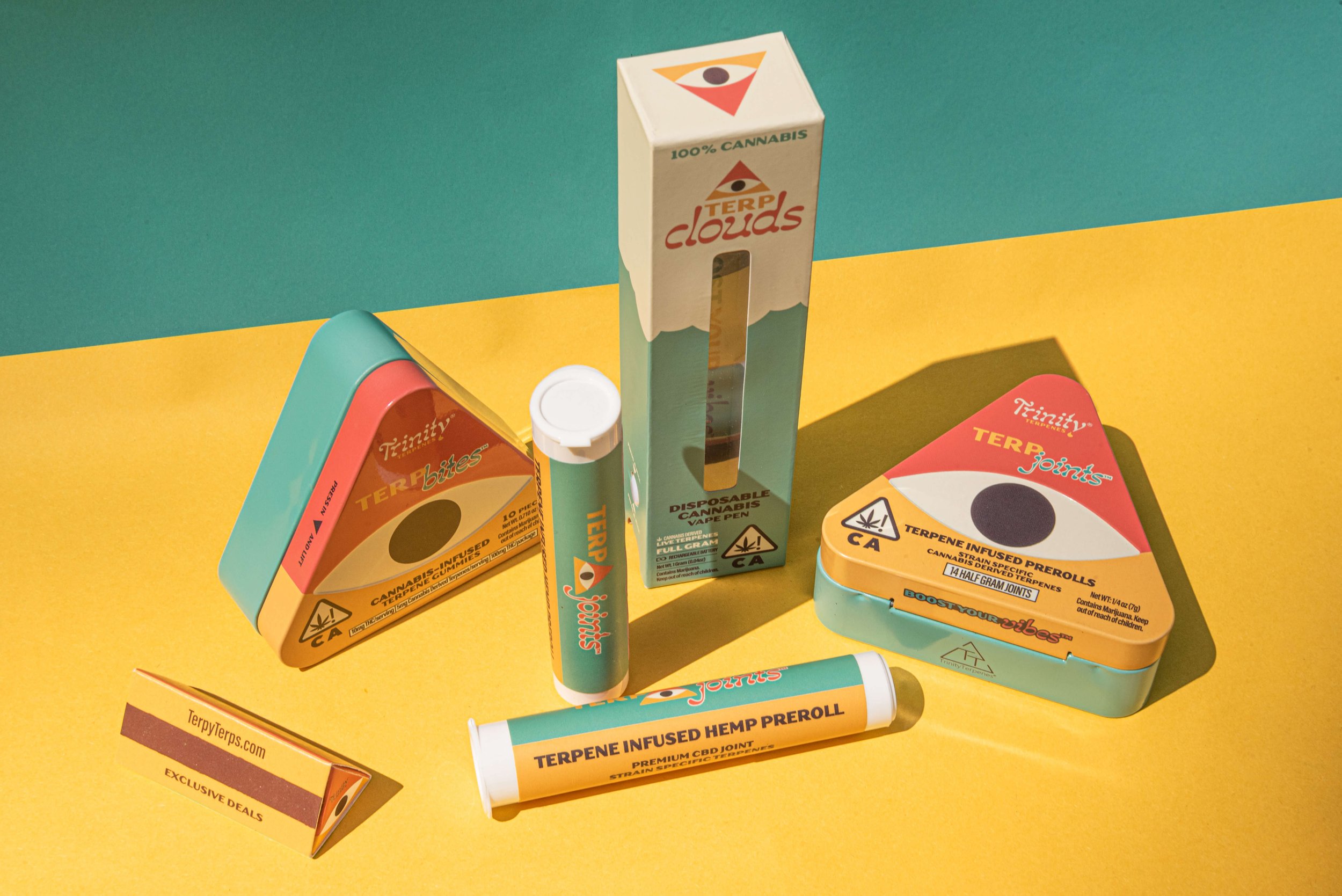
Product lineup

Brand identity

Brand identity
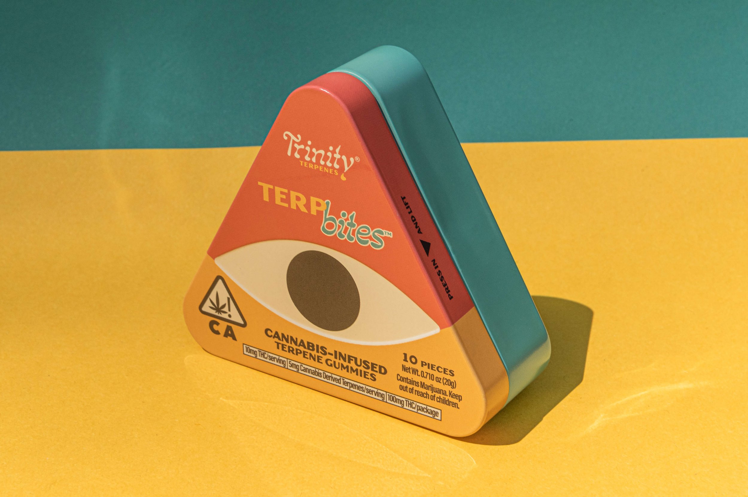
Package design, product photography

Package design, product photography

Package design 3D model
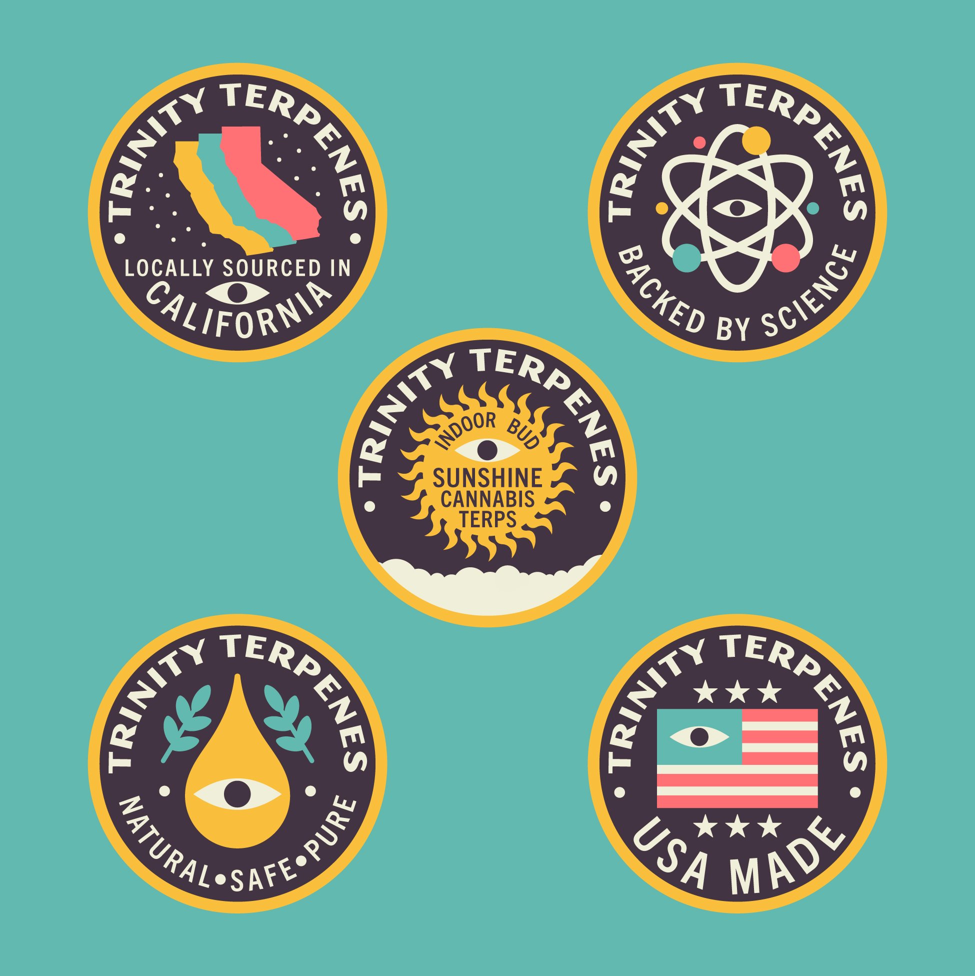
Selling point badges
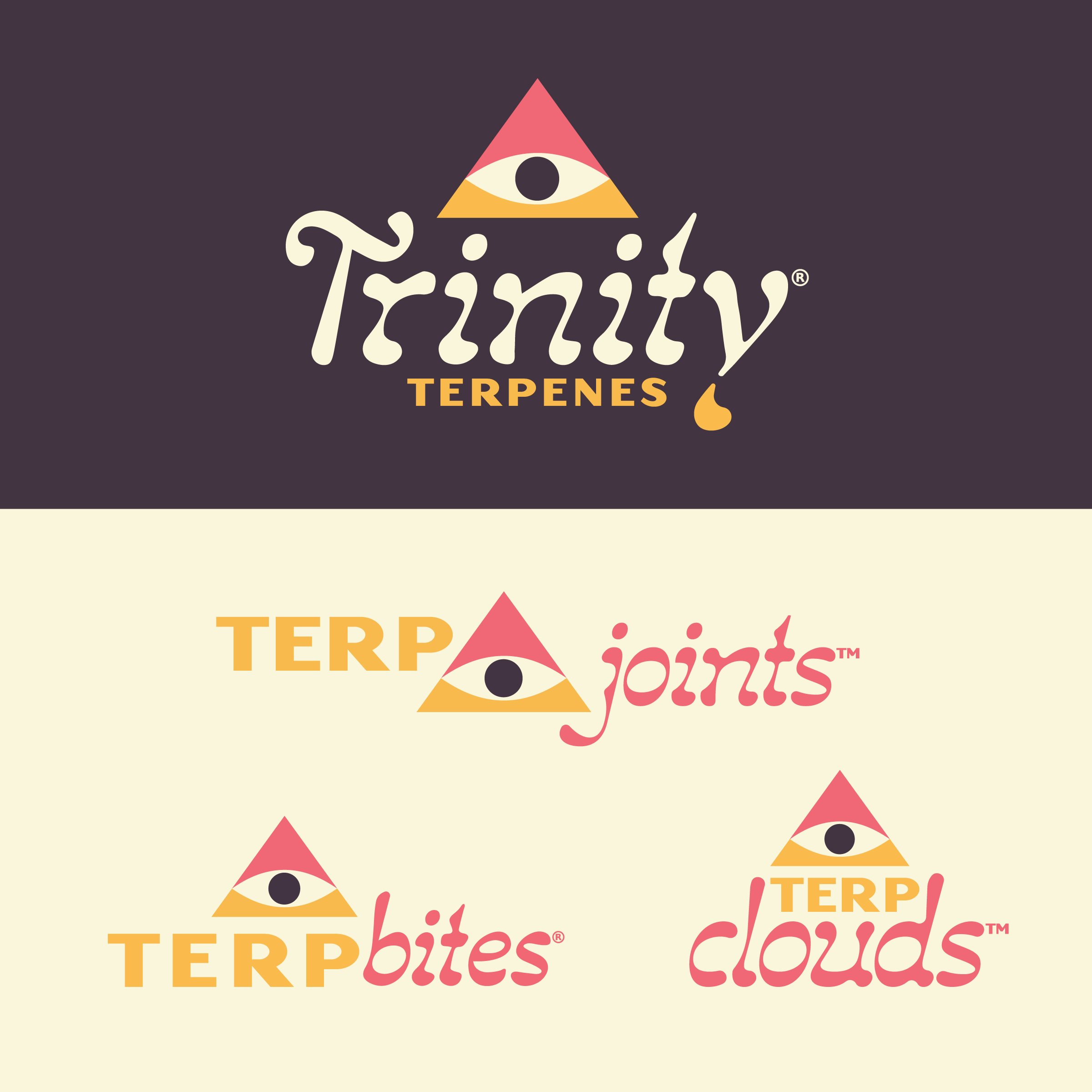
Product lineup logos
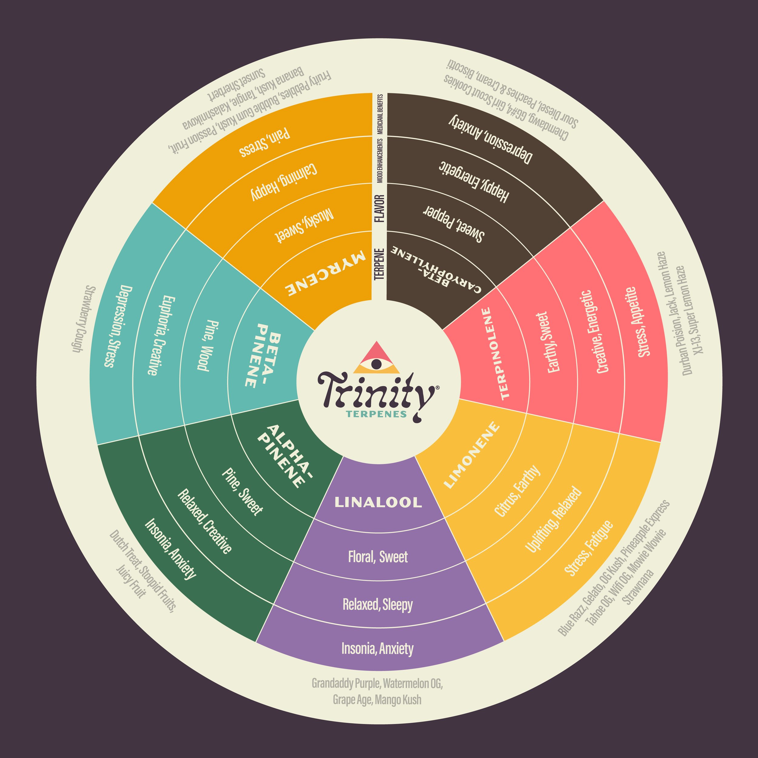
Terpene infographic